Customer Insight: Our customer is in perpetual motion, constantly adapting to the needs of her work, her family and herself. Hardworking and optimistic, she needs a partner who work just as hard for her —
a brand that stands behind her to deliver durable, quality products that endure the test of real life.
a brand that stands behind her to deliver durable, quality products that endure the test of real life.
She requires well-made products that provide a sense of safety, resiliency and pride, empowering her
to build her life and move forward with confidence.
to build her life and move forward with confidence.
Customer Value Proposition: We’re bringing integrity back to shopping. We believe our customers deserve better: brands that are made to last, with products and services that work as hard as they do. Sears is taking a stand against the flimsy, the cheap and the breakable. We’re committing all of our resources to solid, quality, hardworking brands and products to restore your trust in Sears.
And what could be better in this challenging, disposable world? Sears is the store that refuses to compromise on the most durable, high-quality, hardworking people, products and services, so you and your family can live confidently. We exist to have your back.
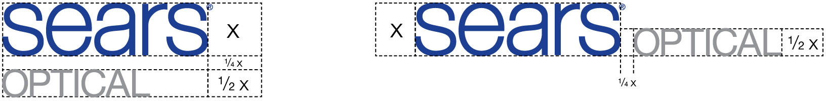
Master Brand Logo
The prior logo was developed for a masculine audience and was reflective of Sears hardlines businesses. Given the lady of the house does the shopping and makes the purchasing decisions in the household, we needed to soften our identity to resonate with her as our target consumer and to better reflect our broadline product assortment. The larger brand strategy also emphasized growth in the softlines businesses and categories to encourage cross-aisle shopping and to increase foot and mouse traffic.
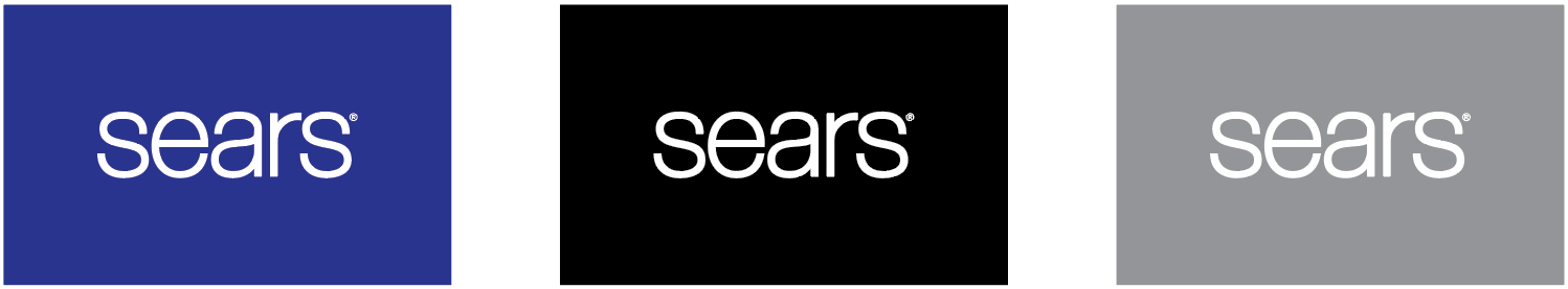
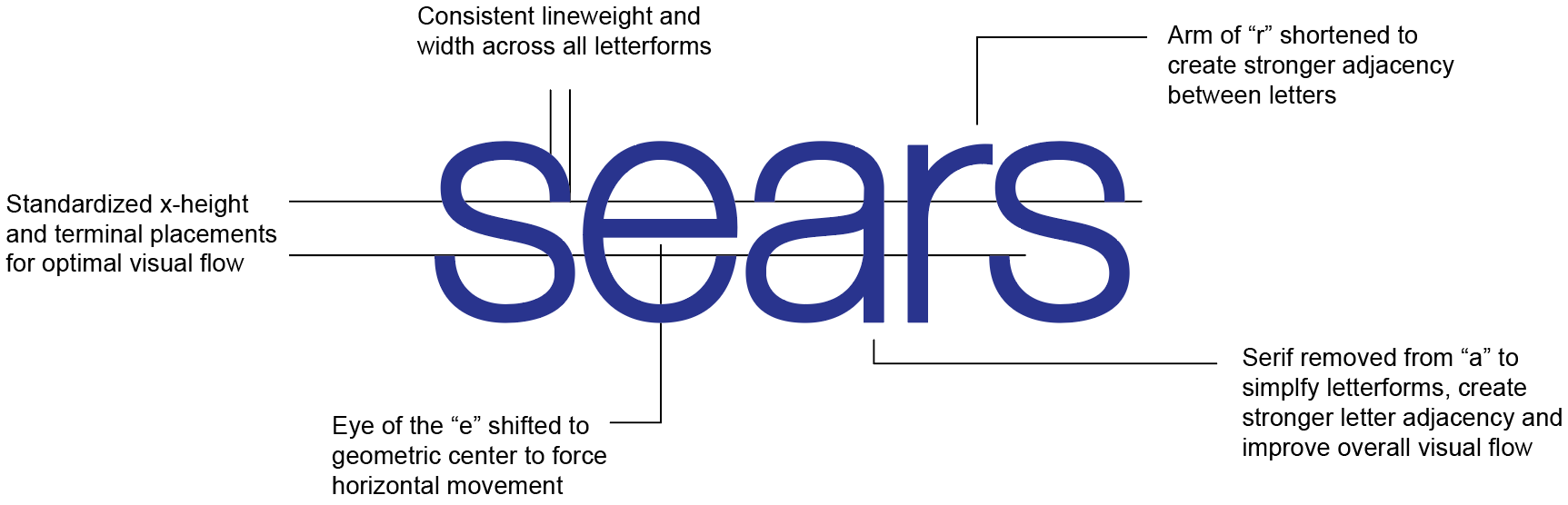
The logo design should convey quality and be versatile enough to support both softlines and hardlines business units... strong enough for a fridge, but soft enough for a sweater. Helvetica Neue 67 Medium was selected for a contemporary, clean, stylish aesthetic. All lowercase letters and a constant x-height were used to soften the tone, be more conversational and approachable and to streamline the profile and visual flow. The relationship between letters creates ligatures that intertwine and create movement through the mark.
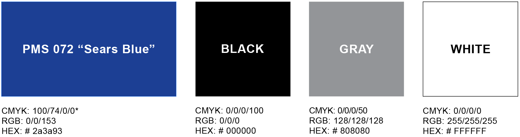
Color Palette
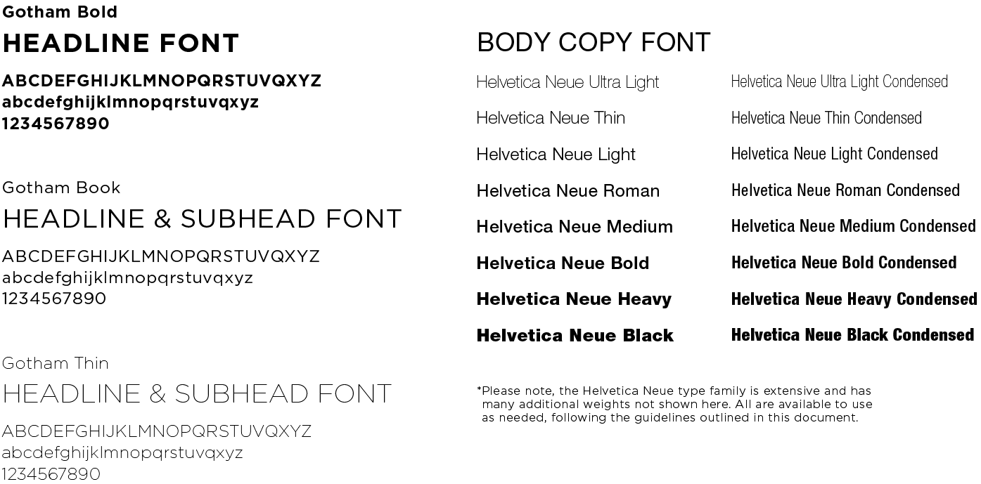
Typography
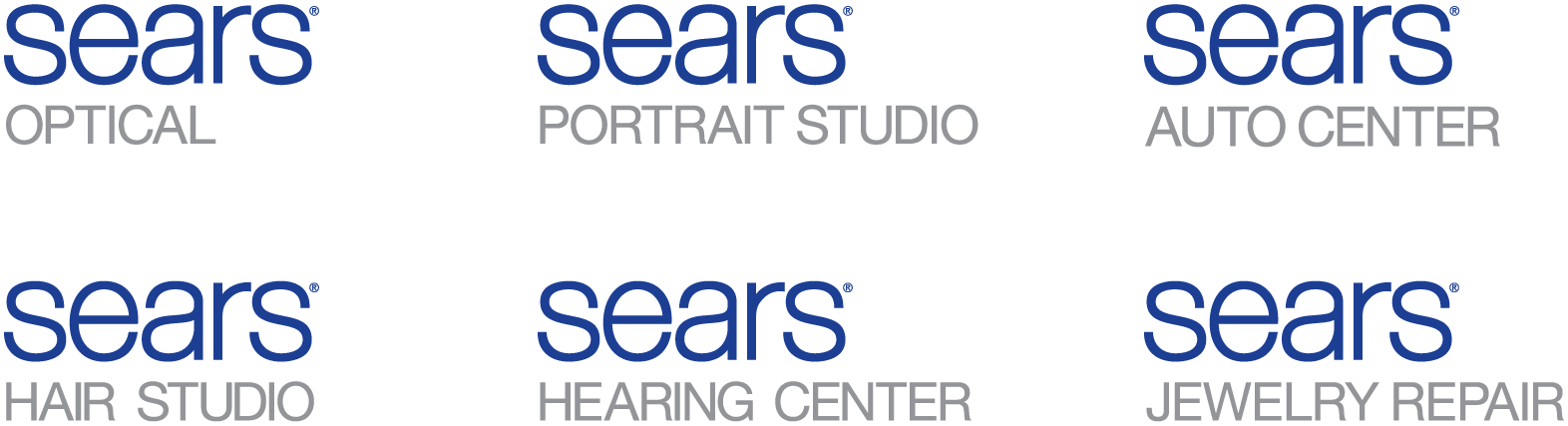
Sub-Brand Logos
Sears has a diverse portfolio of over 40 different and varied licensed businesses.
To best leverage the equity of the Sears brand and to create a consistent brand experience, it is necessary for these businesses to follow the master brand identity format.
To best leverage the equity of the Sears brand and to create a consistent brand experience, it is necessary for these businesses to follow the master brand identity format.
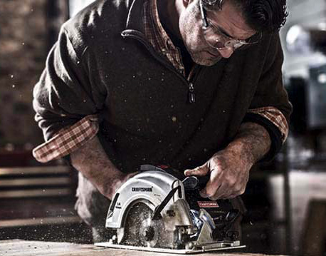
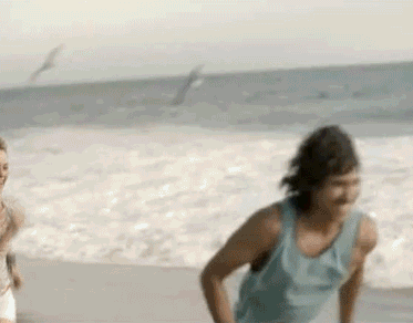
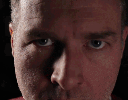
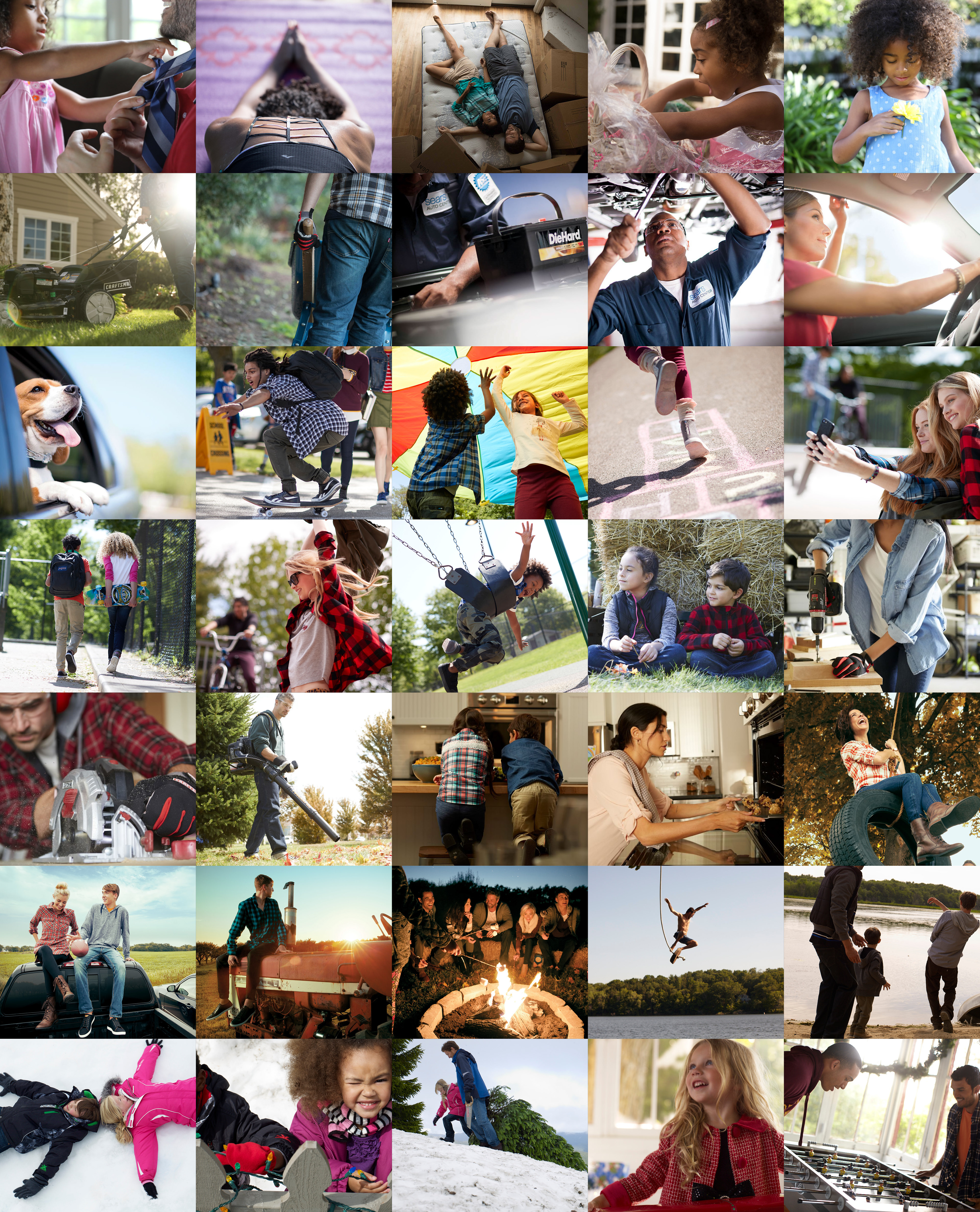
Lifestyle Photography
Editorial brand assets that create an emotional connection with the customer by capturing authentic customer lifestyle moments enhanced by using Sears' hi-quality products and engaging with the Sears brand. These images are candid and genuine, not posed or staged and shot using natural lighting. This photography is shot seasonally and specifically used in brand advertising and campaigns, it is not intended for promotional item-level selling.
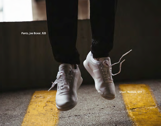
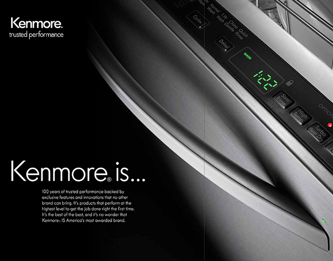
Promotional Photography
Typically shot on white background and used for item-level selling in promotional advertising channels and touch points. Standardized photography guidelines and protocols vary by business unit.

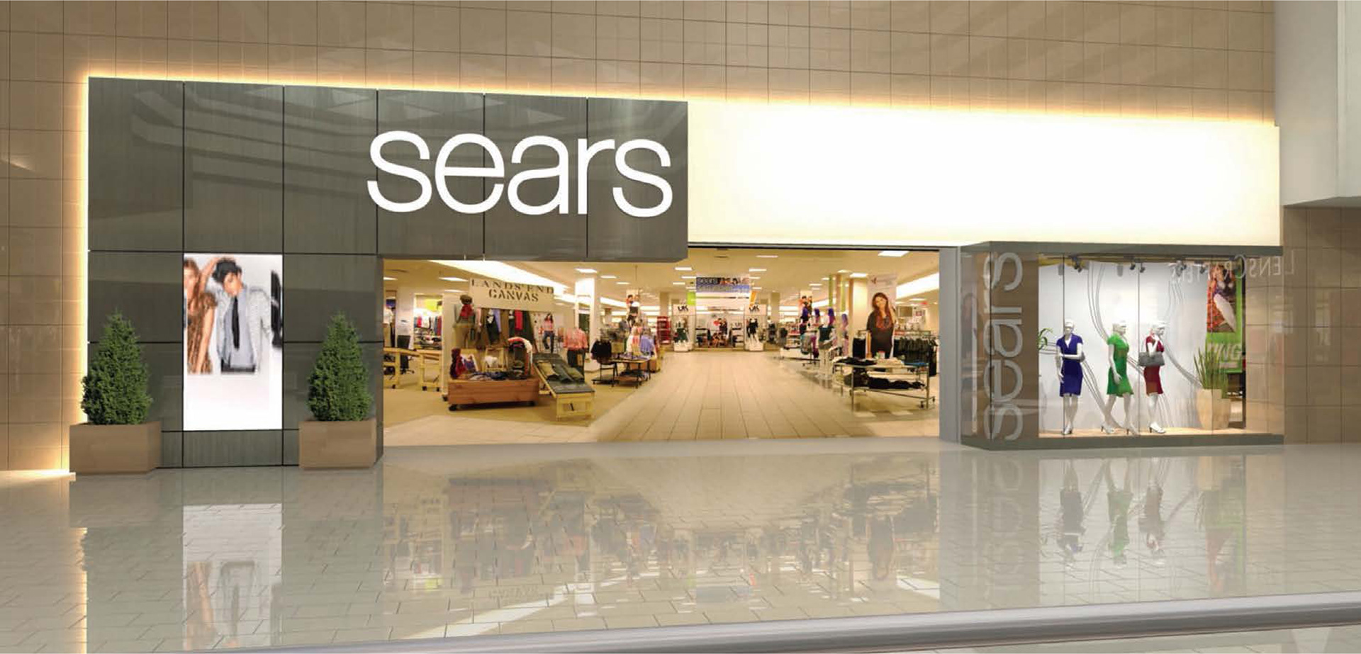
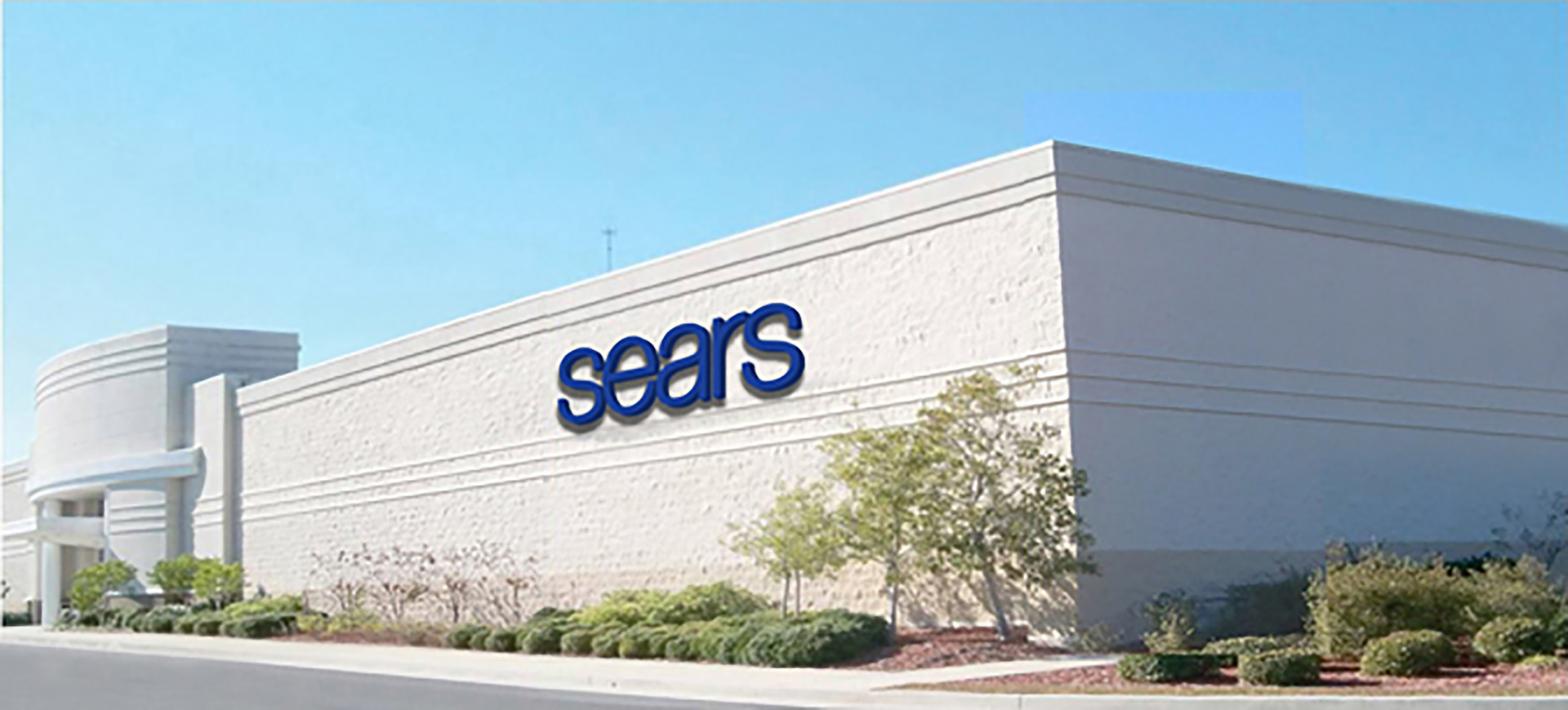
Store Signing_Environmental